Smart
Hip
Creative
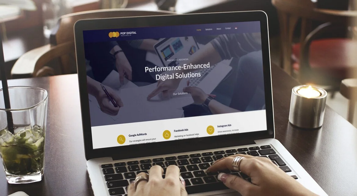
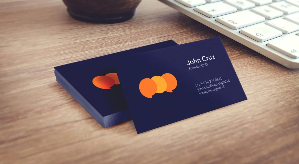
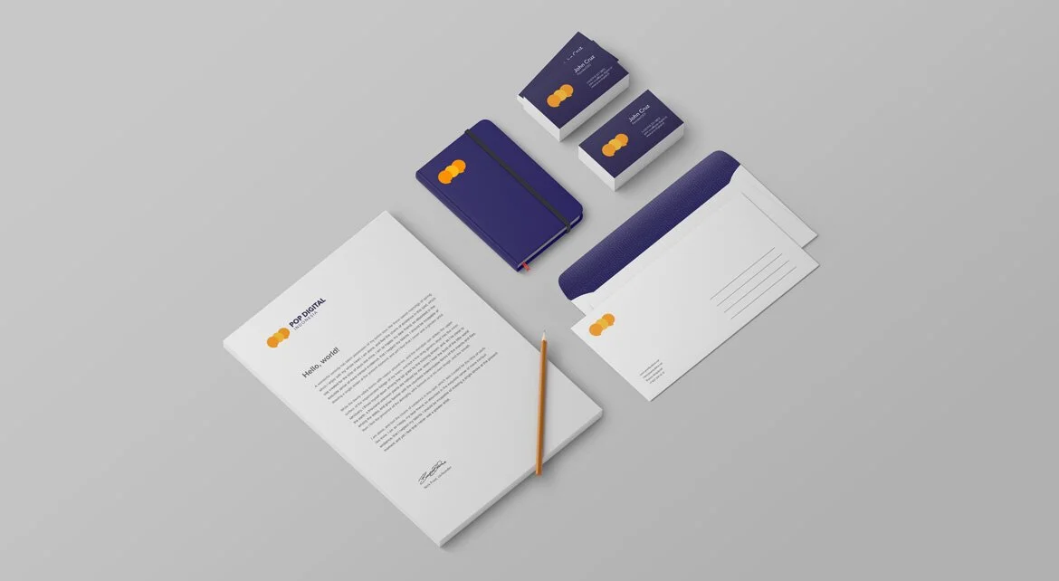
The brand is bold, memorable, and provides a clear image of Pop Digital Indonesia as the digital marketing solutions of the future. The visual identity should project the company’s friendly, smart, and professional persona.
Color Palette
Orange and blue is one of three pairs of complementary (or opposite) colors on the traditional color wheel. When combined, these colors make a striking, high-contrast impression that makes the brand “pop”.
Pizazz
#FC9002Lightning Yellow
#FBB817Midnight Blue
#130D3D
Conceptual Background
Pop Digital's logo is a stylized wordmark with round and soft edges to evoke the feeling of comfort and approachability. The letters slightly overlap to add a touch of playfulness and creativity.