Branding ⸺
Plait is a Practice productivity platform used by innovative primary care providers for patient engagement, service & support.

Brand Words
⸺ Empathy
⸺ Intentional
⸺ Friendly
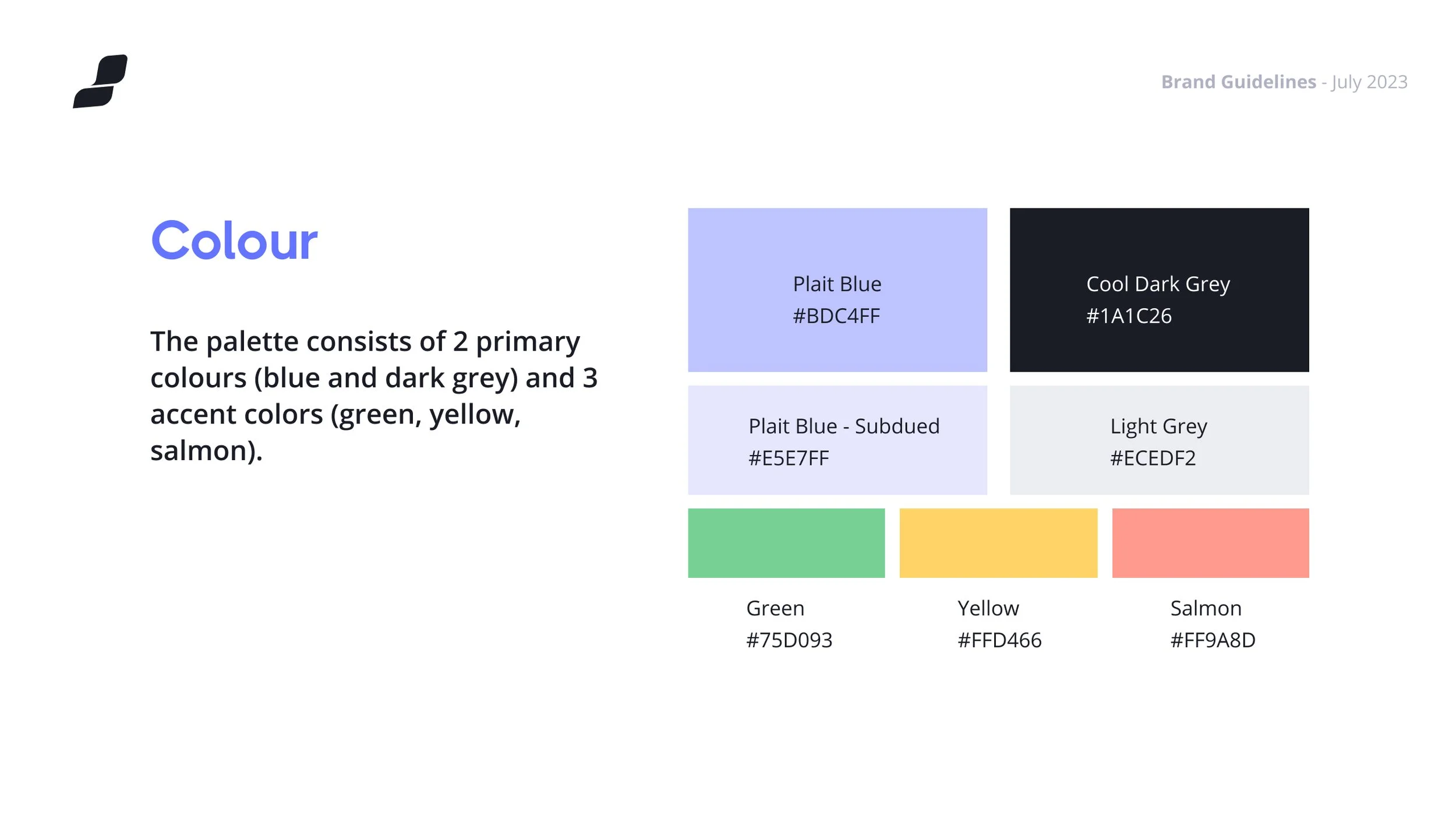
Color Palette
The color of the sky, of air, of breath. A clean and young tint for fresh energy!
Melrose
#BEC4FFCornflower Blue
#6474ffSteel Gray
#1a1d26
Conceptual Background
A plait is stronger and more elastic than the same bundle of strands. And it just looks better!
Our product will take the mess and complexity of healthcare and abstract it away into simple and beautiful interfaces and experiences that anyone can use.
The braid symbolizes the process of making something chaotic into something beautiful.
Brand Identity
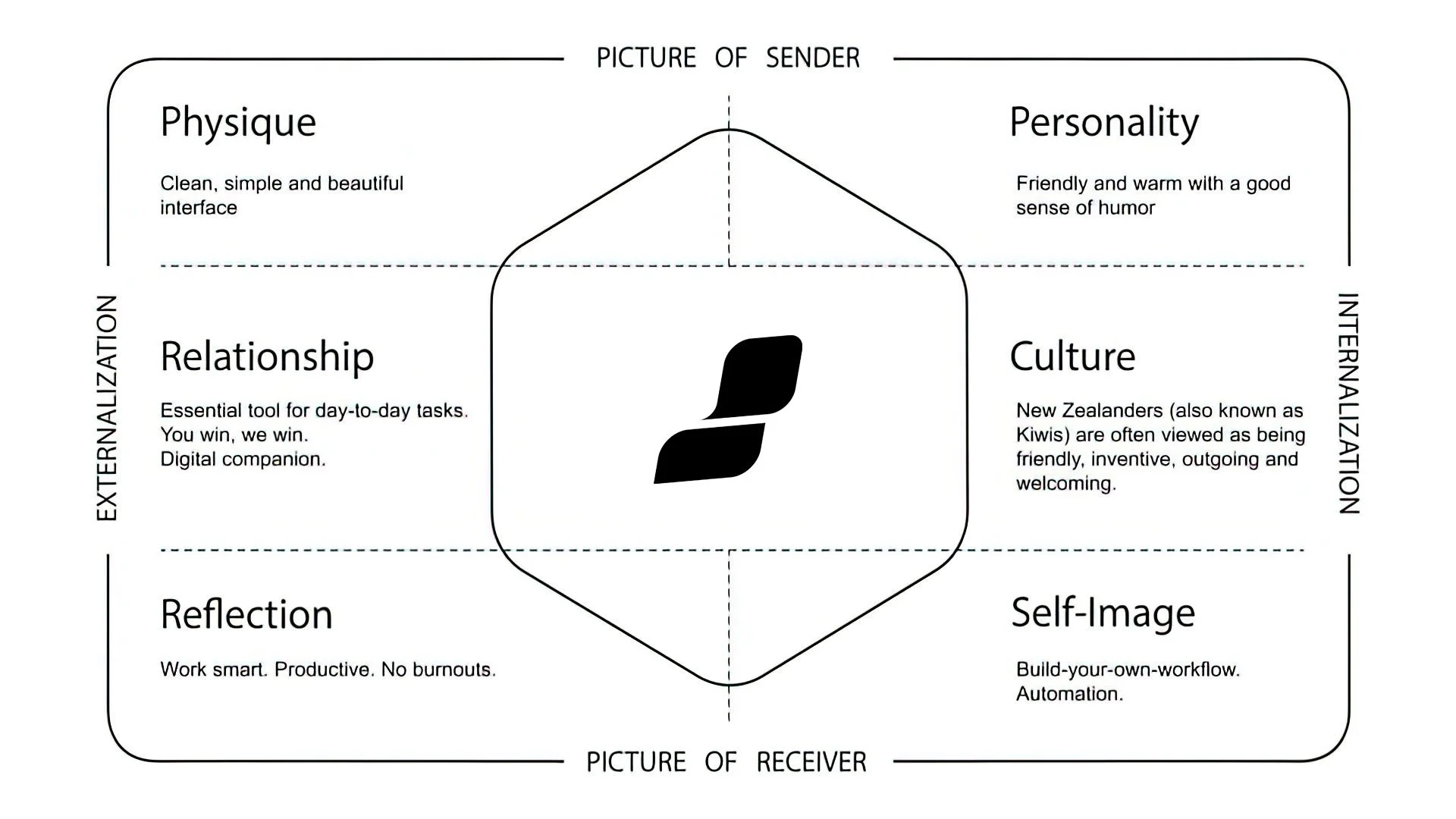
I use Kapferer’s Brand Identity Prism to understand the role of storytelling in branding and building a strong and distinctive brand identity. The purpose of this model is to recognize the parts of the identity and make them work together to tell the brand’s story.