Branding ⸺
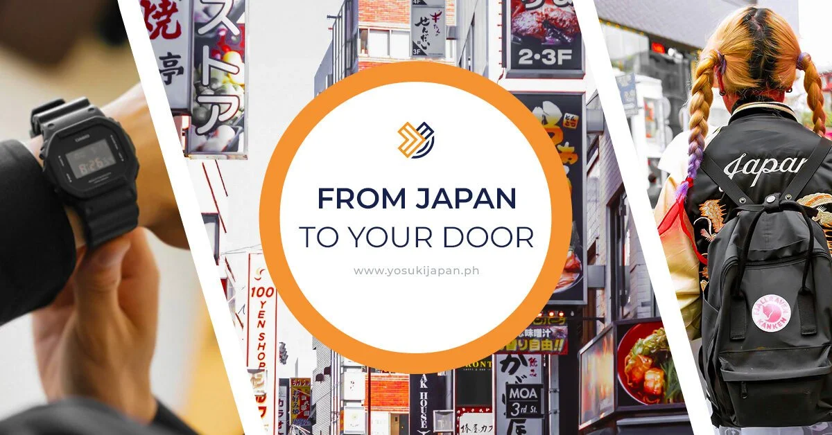
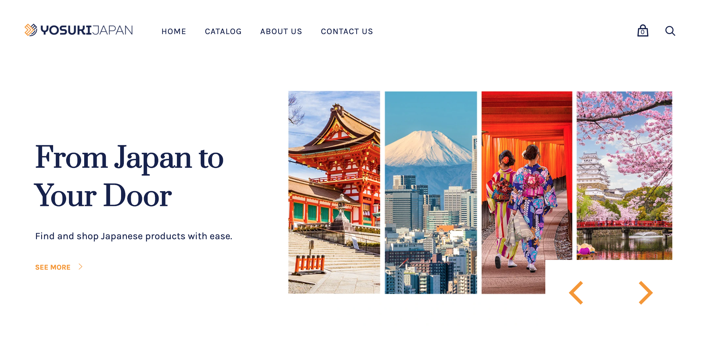
Yosuki Japan is an eCommerce company that offers 100% Japanese-made products to the Southeast Asian market. The brand should exude professionalism, reliability, and trustworthiness and at the same time spark joy.

Brand Words
⸺ Authentic
⸺ Reliable
⸺ Trustworthy
Color Palette
Color psychology suggests that blue is a color of calm, honesty, security, and confidence. Blue in the logo helps to establish trust-based relations. The color orange complements the primary color and it adds fun, energy, and warmth to the brand.
Midnight Blue
#17234dTree Poppy
#f7941dDodger Blue
#4370FF
Conceptual Background
The logo consists of parallel lines where the prominent lines resemble an arrow. The arrow signifies direction so when a customer is thinking of buying authentic and affordable Japanese products, this logo is telling them “Here! We have what you need. Come, buy here!”
The curved lines below the logo soften the rough edges, making it more balanced. It also means support and assistance.