Branding ⸺
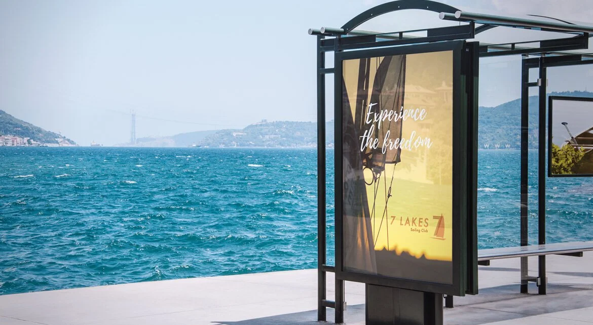
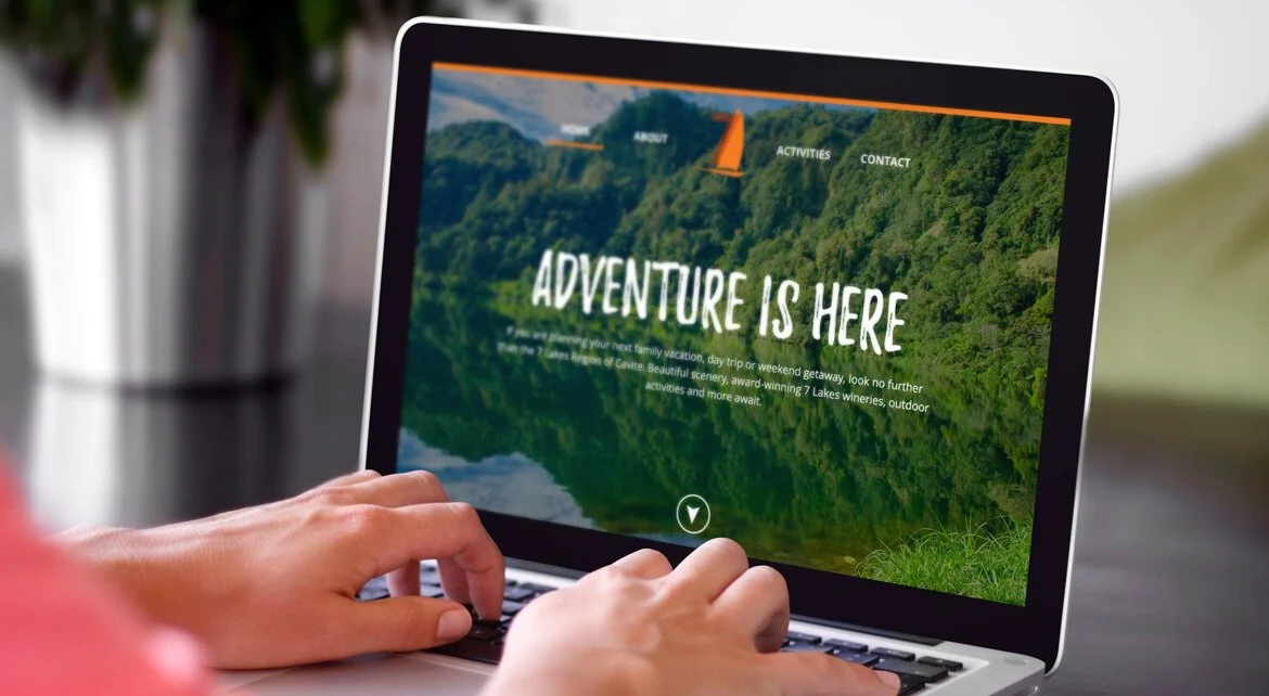
The overall vibe of the 7 Lakes brand should facilitate a sense of adventure where people can come together, hang out, and have fun.

Brand Words
⸺ Cool
⸺ Fun
⸺ Adventure
Color Palette
The color scheme is based on earthy tones as they convey simplicity, durability, and stability. The shades of brown and orange also invoke the feeling of exuberance, fun, and approachability - perfect for the outdoors.
Mud
#F47B20Sunset
#BE3100Terracota
#6F0B00
Conceptual Background
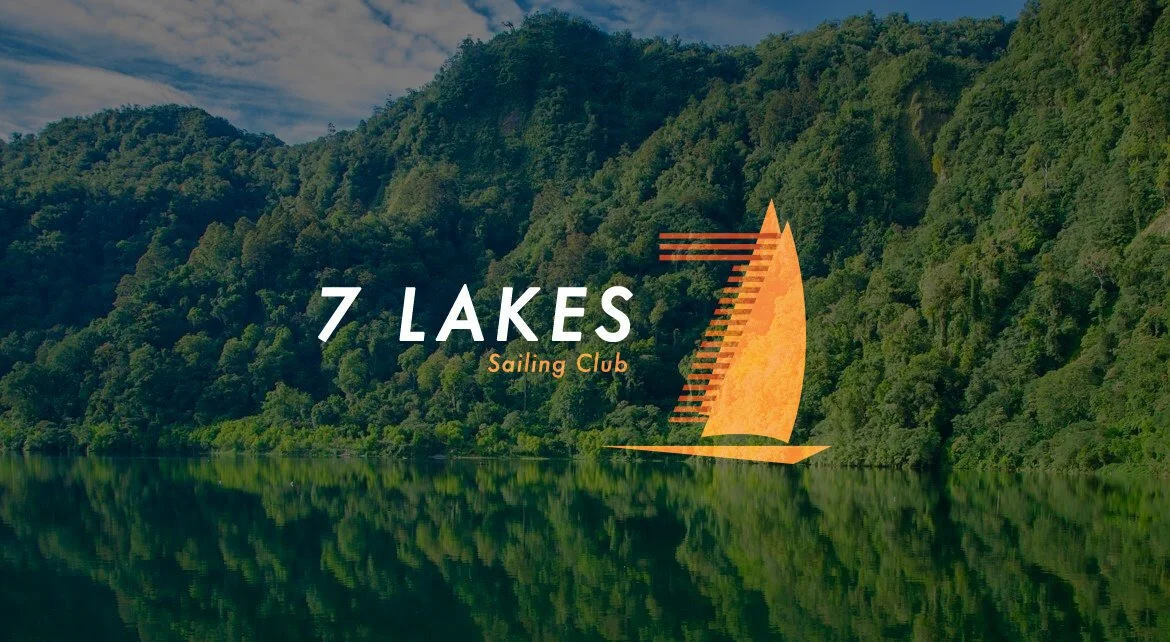
The 7 Lakes logo consists of lines and triangles.
The triangle shape symbolizes a sail, a mountain, and a house. The logo should be associated with both the excitement of the outdoors and the safety of home.
The lines represent the wind which is associated to outdoors, action, and adventure.